Shirely Hughes


Shirley Hughes is one of the best-loved and most innovative creators of books for young children. She has written and illustrated over 50 books, sold more than eight million copies, won major awards and created some of the most enduring characters in children's literature, including Lucy and Tom. Author and illustrator Born 16 July 1927, West Kirby, Cheshire, England United Kingdom.

She was educated at West Kirby Grammar School, and studied drawing and costume design at the Liverpool School of Art, then the Ruskin School of Drawing and Fine art in Oxford. She was there encouraged to work in the picture book format and to make lithographic illustrations. Hughes began her work during the 1950s and 1960s by illustrating other authors’ books, such as My Naughty Little Sister by Dorothy Edwards and The Bell Family by Noel Streatfeild. In 1960 she wrote and illustrated her first book, Lucy & Tom’s Day, which was made into a series of stories. She went on to write over fifty more stories, including a series about a young boy named Alfie, and his sister Annie-Rose, as well as the Olly & Me series. An exhibition of her work was put on at the Walker Art Gallery in 2003, which then moved to the Ashmolean Museum in Oxford.

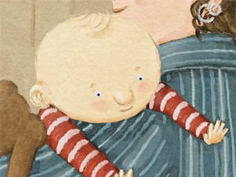
From what I have seen her illustrations are very accurate, more life like rather than cartoon etc, this is probably due to the story's she writes, they are for children to really imagine they are part of the journey and the story involved. I like Shirley’s work as the bold and bright colors are highly ascetically pleasing and her style of work is remaniciant of may childhood books. The use of shading and light really brings the illustrations to life. I do enjoy this style of illistration however it is not my chosen style of work as i prefer a more graphic approach to art. 

Kathleen Hale

Kathleen Hale was born in 1898 in Broughton in Lanarkshire and was brought up in a suburb of Manchester. Her childhood was far from idyllic, her father died when she was very young and she was forced to endure long periods of separation from her mother. This, along with the frustrations of an unexpressed artistic talent, produced a rebellious reaction in the young girl's naturally ebullient nature. 

In 1917, Kathleen moved to London to make a life for herself as an artist. She worked for some time as Augustus John's secretary whilst developing a wide circle of friends in the artistic community, such as Vanessa Bell and Duncan Grant. During the twenties she earned a living as an illustrator, accepting commissions for book jackets as well as selling her own drawings. She created Orlando and his world to entertain her children at bedtime. Kathleen Hale died on 26th January 2000 at 101 years of age.

Orlando The Marmalade Cat 'with eyes like twin gooseberries' was one of the most popular classic children's book characters of the 1940s and 50s. The stories are renowned for their quirky wit, magnificent illustrations and their ability to combine excitement and adventure together with and appreciation of friendship and family life. The books continue to be read by generations of readers who have come to regard Orlando with great affection and delight in the nostalgic memories evoked by the stories. As the creator of Orlando, Kathleen was awarded the OBE in 1976.

http://vintageposterblog.com/wp-content/uploads/2011/09/ppb-orlando.jpg
In the above link is an article written by weekend telegraph about an interview with Hale herself. In the article she tells the telegraph that she hates Orlando, her most famous creation. The interviewer asks if there will be any more Orlando books, but she replies with " there are too many already", also giving "because they are so awful" an answer to why she had not looked at the books in years. 
Not having read the books as a child i am unsure on how to take the storys, i am awaiting a copy of 'Orlando the marmelade cat - a camping holiday, i was intrigued to see what i had missed out on as a child, from looking at the illustrations used in the books, through the illustrations she has managed to build up an image of a mischievous cheeky ginger cat.


Although such a well loved creation, it is clear to see that Hale feels this creation has obviously hindered her progress and ability to move onto new projects. She got caught up in the continuous production of the story of the marmelade cat that she never got the chance do broaden her mind.

Eboy

eboy.co.uk
They express their art as an extension of their childhood. Their influences come from: “Pop culture… shopping, supermarkets, TV, toy commercials, LEGO, computer games, the news, magazines…”Kai was the only one who grew up with Nintendo to inspire him, the rest of the eBoys lived in East Germany where video games didn’t exist.Their work makes intense use of popular culture and commercial icons, and their style is presented in three-dimensional isometric illustrations filled with robots, cars, guns and girls. Mostly their designs are printed today and not used solely for computer screens anymore, allowing images to get more complex with details.“If we don’t work on other projects at the same time it takes about six to eight weeks to finish a very detailed cityscape, three eBoy’s working on it, nearly full time. But, if we have to do it in our spare time, which happens often, it could take years to finish a picture since we can’t spend so much time on it.” Their unique style has gained them a cult following among graphic designers worldwide, as well as a long list of commercial clients. Their latest project are plastic Peecol toys with Kidrobot, and soon a new line of wooden toys are to be produced under their own label.

http://blog.donax.ch/public/images/Posts/vevey-eboy.png
Their work is fun, futuristic and crazy, the only words that can describe Eboy. Eboy creates artworks created from complex illustrations ranging from robots, buildings, cars all the way through to people. Eboy also has a wide range of products available to purchase such as t-shirts, posters, and souvenirs. Eboy also has artwork displayed in gallery exhibitions. A very different approach to design making use of various different illustrations to build up a imaginative society. The pixelated work style reminds me of a "Where's Wally" type illustration, I really like their work! 


Peter Saville


Peter Saville is a designer whose twenty-five year practice spans the fields of graphics, creative direction and art. Born in Manchester, England in 1955, he studied graphic design at Manchester Polytechnic from 1975-1978.

In 1979, he became a founding partner of the landmark, independent record label Factory Records where he created some of the most recognisable album covers of all time for Joy Division and New Order. Saville’s many clients have included Roxy Music, Ultravox, Peter Gabriel, Pulp, Suede, Whitechapel Art Gallery, The Pompidou Centre, Yohji Yamamoto, Jil Sander, Christian Dior, Alexander McQueen, Stella McCartney, Mandarina Duck, Givenchy, Selfridges, EMI and Adidas.

Saville’s reputation for contributing to the progressive design profile of the city of Manchester since the early 1980s has earned him an ongoing consultancy to programme Manchester’s artistic future from its city council and an honorary doctorate from his alma mater, now at Manchester Metropolitan University.

Saville creates artworks for both the Paul Stolper Gallery and Hotel in London and Gallery Neu in Berlin. His work is noted for combining an unerring elegance with a remarkable ability to identify images that epitomise the moment.

He is a talented designer. I like use of colours that he applies in his works by transmitting light onto them. I consider him a genius of art to draw attention through what he produces. He is widely seen as an important and influential figure, amongst the design industry.

John Maeda

John Maeda is a Japanese-American graphic designer, computer scientist, university professor, and author. His work in design and technology explores the area where the two fields merge. He is the current President of the Rhode Island School of Design. He is a world - renowned graphic designer, visual artist, and computer scientist MIT Media lab, and is a founding voice for "simplicity" in the digital age.He jokes about himself as “the guy who makes the flying letters.” But behind this joke is a deep insight into the way good programming can create new forms of good design — the guiding principle of Web 2.0, where type and images can behave in brand-new ways to communicate and amuse.

I enjoyed his laws of simplicity" book after studying it myself for a previous typography brief. He describes his theory by using what he calls 'cookie vs laundry method' in this methods he explains that, if you gave a child the choice between a big cookie or a small cookie, they will pick the big cookie, but then said if you gave the same child the choice between a large laundry basket full of clothes and then a small laundry basket, the child will pick the smaller basket, this theory is based on the rule that we all want more for less, enjoy more and work less.

Although I am not a graphic designer myself, I think Maeda's work is brilliant, and his laws of simplicity is something I can take across within my illustrations, as sometimes less is more. This is a good way to think as usually the more simple something is, the bolder and more impact it creates. 

http://www.33rdsquare.com/2012/10/john-maeda-talks-design-and-leadership.html

Pentagram - Design Company

Pentagram is one of the world's largest independent Design Consultancy. The company is one of the biggest multi-disciplinary design consultancy firms, that is shared and ran by 16 partners, friends who are all individual artists within their creative fields.

They have bases in London, New York, Berlin and Austin. Each client works directly with one or more of the partners. This reflects their conviction that great design cannot happen without passion, intelligence, and personal commitment, which is demonstrated by a portfolio of work that covers five decades.

After looking at their website and other examples of their work I feel that a lot of the work for clients are a similar style, even though they are for different companies. I think this is a good trait as although they are a graphic designers and can mould to fit any clients specifications, the fact that their own styles still show through the design make the company more easily recognisable a good trait for any artist/designer to have. All of their design pieces are flat and perfectly crisp outlines, and look extremely professional in my opinion.

source: http://www.pentagram.com/work/#/posters/all/newest/

Tomato - Design Collective

Tomato is a "Art & Design Collective" founded in 1991 by John War Wicker, Steve Baker, Dirk Van Dooren, Karl Hyde, Richard Smith, Simon Taylor & Graham Wood. They were originally based in London. They are a collection of designers, craftspeople, musicians and writers, this making them the widely creative diverse group that have helped them within their success.
tomato.co.uk/newyear
Tomato provides the following services: Architectural Design, Consultancy, Drawing, Education, Electronic Interactive Media,Film & Commercial Direction, Graphic Design, Fashion, Motion Graphics, Music & Sound, Strategy, Branding & Identity, Photography, Publishing, Title sequences & Typography.
Tomato have exhibited internationally and lecture and hold workshops widely. Their designs that incorportae multiple platforms are commited to developing entirely new media solutions for clients including packaging design for Casio, to shoe design for Adidas, to a TV commercial for Chanel. 
Their work is brilliant and emphasises all of their conceptions beautifully and individually in order to capture the attention of the public and achieve the clients intent.

J Otto Seibold

http://tuttalacartadelmondo.blogspot.co.uk/2009_01_01_archive.html
J. Otto Seibold is an illustrator of children’s books, as well as some picture books intended for all ages such as Going to the Getty, including pieces such as 'Monkey Business', 'Penguin Dreams' and 'Alice  n (pop-up) Wonderland' He has showed at Grass Hut, The Yerba Buena, and Le Estrange in Paris.

From the work I looked at, his illustrations appeared similar to other children's book illustrator's, until I found some work which encoporated 3D pop-up books (pictured right), something I had have not seen from many illustrators; it is a really unique way of displaying illustrations, and makes it more exiting and full of fun for children when reading books. His use of vibrant colours in bold block colours are the elements that make them appealing to children, and you can clearly see why his illustrated characters are loved by children. Definitely an illustrator I can take inspiration from.
https://blogger.googleusercontent.com/img/b/R29vZ2xl/AVvXsEhI4ae6TTFlJ_AjlUL3mS-HimZHBmWdF4uR9NA2DUKThaO6FRNz1yG3_bcYz_9i5fPB51eX5bqasmvaSrHEbWjJxWpTg5Q75E7GlSgH1jDn7t3AwOYMMbgXRDrQ7o2w_FtRxAuREcpInCI/s1600/othergooseinteriorart.jpg

Lauren Child

http://images.wikia.com/laurenchild/Charlie_and_lola.jpg

Lauren Child was born 1965, London and is an English author and illustrator. She is typically most famous for Charlie & Lola illustrations, and is loved by many children for her creations after them being turned into a Television series for many to watch. Her success I think is fantastic, especially considering she didnt start her career until her mid thirties after what she describes as fitful, frustrating university career (a “disastrous” year studying art at Manchester; a disappointing mixed media course at City and Guilds) she spent her 20s “floundering dreadfully”, living hand-to-mouth in London. She introduced Charlie and Lola in 2000 with 'I will not ever Never eat a tomato' and won the annual Kate Greenaway Medal from theLibrary Association for the year's most "distinguished illustration in a book for children"

She has a unique style as she produces her illustrations. She plays with bright colours and inspirations taken from where she lives. Her style reminds me of Quentin Blake's style. She uses bold colours for the background, in order to bring out the characters, along with bold black outlines. This along with they typica-child-like poses she places her characters in, they emphasise the movements and thoughts of children perfectly. She is one of my all-time favourite illustrators that is widely known for her beautiful creations.
http://heidigracekress.com/cms/wp-content/uploads/2012/03/Lauren-Child-with-trees.jpg

Scott McCloud


He was originally born Scott McLeod on June 10, 1960. He is an American cartoonist and theorist on comics. He is most notable for his non-fiction books about comics. He has been creating comic books since 1984. 
One of his most famous books is 'Understanding Comics', a book of his that I own myself, is a comics book written about comics as an artistic medium, and how to create them. McCloud believes that comics have been in existence for centuries, although many great works of art are erroneously categorized as other art forms instead of comics. He explains the fundamentals of the genre, including the passage of time, depiction of motion, and broad interpretation by the reader as elements unique to comics.

He uses just black ink on white paper to create very simple and precise illustrations, makes use of line drawings. These are then taken onto photoshop to add the blocks of colour to, they are easy to read and understand. After owning one of his books, I have been admiring his work for many years. Although it is a style I cannot create myself, comic book art itself is a very skilled type of illustration, making them all flow continually and fit perfectly to convey the story to the target audiences. 

Photo source:
https://encrypted-tbn2.gstatic.com/imagesq=tbn:ANd9GcTrZo0P8dE8YWFqQKeBLgrJAgTWHFvOfs7X6J8Ld_pzGc4qQsVH

Joel Stewart

http://www.joelstewart.co.uk/blog2/peeksamples/03.jpg
Joel Stewart from London, United Kingdom Illustrator, author and director of The Adventures of Abney & Teal, currently on CBeebies.

He began his career with the picture book The Adventures of a Nose, which he conceived with author/illustrator Viviane Schwarz. Joel says, "It's really great that I got started with such a bizarre concept, as it's allowed me to be quite free with my ideas subsequently. Bizarreness is not the point, however. I see the core of what I do as emotional narrative. It just takes some strange ideas to put this across sometimes."

http://www.joelstewart.co.uk/blog2/peeksamples/03.jpg

Joel has written his own self-authored picture book and hopes to do more writing in the future. He would especially like to create comics for children.
When he was younger Joel Stewart wanted to be a sloth, this showing at young age he had an strong  imagination. His love for animals, along with his vivid imagination, has influenced his illustrations, which is the source for these unreal creatures that he creates. He creates different animals, that make up one mythical creature, his illustrations include widely exaggerated features. He adds personality and character to each of his illustrations, making them seem more alive.


Kyle Cooper

Kyle Cooper has directed over 150 film title sequences, and has been credited with "almost single-handedly revitalizing the main-title sequence as an art form". He is the founder of two internationally recognized film design companies, Imaginary Forces and Prologue Films. Cooper earned a M.F.A. in Graphic Design from the Yale School of Art, where he studied independently with Paul Rand. Cooper is a member of the Alliance Graphique Internationale and holds the honorary title of Royal Designer for Industry from the Royal Society of Arts in London. Claims his greatest influence in his choice of profession (i.e. title designer) is Stephen Frankfurt's opening title sequence for To Kill a Mockingbird (1962).
Directors don't call on Cooper for a signature style; they hire him to dig under the celluloid and tap into the symbolism of a film. That aptitude first became apparent in 1995, with the abrasive and highly stylized intro to David Fincher's Se7en. 
As a filmmaker, Cooper is all about precision. When you're doing a two-minute movie, being obsessive about every cut, every transition, and every manipulation of every letter is a job requirement.The production on Spider-Man 2's titles, from conception to delivery, has stretched almost an entire year. Cooper began by digitally scanning dozens of vintage Spider-Man comics and editing them together in a blink-and-you-miss-it five-second montage that encompasses the entire story arc of the first film. I think his work is brilliant as a filmaker, you can see as the audience that he has studied the film that he is trying to advertise, the subliminal messages that are hidden within the original film are sought-out and played on through the trailers he creates. 

https://blogger.googleusercontent.com/img/b/R29vZ2xl/AVvXsEgbzo97Hr0Me1LMQq-vazMI4_aOvLF5cXZ1gGAZyqvjVqXHQ3IFqrzKD55OfHWsXCFfcF0a1Pm4Di7zg5cHDpljgQjtjKWcFyKDdggnCjr8NxkuxPrjycnmKR4SlSPlkHKhAAEd1OpwRKE/s1600/Descredit-se7en844.jpg

Michael Gondry

Michael Gondry born May 8, 1963) is an Academy Award-winning filmmaker, whose works include being a commercial director, music video director, and a screenwriter. He grew up in Versailles with a family who was very influenced by pop music. When he was young, Gondry wanted to be a painter or an inventor. In the 80s he entered in an art school in Paris where he could develop his graphic skills and where he also met friends with whom he created a pop-rock band called Oui-Oui.  
One of his videos was shown on MTV and when Björk saw it, she asked him to make her first solo video for 'Human Behaviour'. The partnership is famous: Gondry directed five other Björk's videos, benefiting by the huge budgets. This led to commissions for other artists around the world, including Massive Attack. He also made a lot of commercials for Gap, Smirnoff, Air France, Nike, Coca Cola, Adidas, Polaroid and Levi - the latter making him the most highly-awarded director for a one-off commercial.
I think he manages to convey himself through his film basically he can do what many do not. His work is unusual however you can tell that he is passionate about being arty and his work express his love and experience of the industry, growing up around many strong current influences. 

http://collider.com/wp-content/uploads/michel_gondry_image__1_1.jpg

David Hughes

http://www.centralillustration.com/CMS-data/artist-images
He was born in Twickenham in 1952. He describes himself as "a graphic designer who happens to illustrate." Expressing the desire to become an artist from a young age, he studied at Twickenham Technical College in the early 1970s, completing a four-year course on (largely technical) Illustration. Towards the very end of his course, he discovering an interest in etching and produced "a small series of etchings based on a piece of jazz by Charlie Parker."
After leaving college, he produced his first commissions for The Daily Express's cookery page, but became frustrated and disillusioned by the lack of creativity involved. A lack of "sympathetic advice" saw him abandon drawing for "a year or so," to become a postman. During this time (mid-1970s), he was re-inspired by a Post Office colleague to take up life drawing again, and eventually became aware (through the work of "amongst others, Ian Pollock, Russell Mills and Chloe Cheese") that there was a market for his talents.
His illustrations were not what I expected when I initially looked at them. I have to admit, his work is not my normal taste in illustrations, they try to imitate some humour and character however I find most are bland and dull. The markings are scratchy and they seems as if it takes just a few minutes to produce them.

Jonny Hannah

Jonny Hannah was born and bred in Dunfermline, Fife. He studied illustration at Liverpool Art School and the Royal College of Art. Since graduating in 1996 he has worked as a freelance illustrator. His many clients include The Daily Telegraph, The New York Times and The St Kilda Courier. Any spare minute is spent at The Cakes & Ale Press, Jonny's cottage industry, producing fine printed ephemera, from his garden shed in Southampton. In 2000 Jonny won a BAFTA for his film The Man With The Beautiful Eyes.
He uses print (screen, linocut, monoprint etc) to create work that looks like it is made of collage to create his illustrations/graphic pieces. In his work, it is obvious that there has been a lot of thought into text within the illustration in order to convey the messages of the piece, however it is not to my own personal taste. 

Ian Pollock


Ian Pollock is from Cheadle, Cheshire in 1950, the son of Gordon Pollock, a traditional claypipe manufacturer. He was educated at Woods Lane Secondary Modern School, and Moseley Hall Grammar School, Cheadle, Cheshire. He then did a foundation course at Manchester College of Art and Design, and in 1970 went to Manchester Polytechnic. On graduation as BA with First Class Honours in 1973 he went to the Royal College of Art, and on getting his MA in 1976 became a freelance illustrator.
He has published and illustrated a number of books – starting with Beware of the Cat in 1977, and has designed posters for the Royal Shakespeare Company. He works mostly for magazines and newspapers, appearing regularly in the “quality press.” His work has appeared in Rolling Stone, Playboy, Penthouse, New Yorker, Talk, Esquire, GQ, New York Times, Wall Street Journal, Elle, Country Life, Radio Times, New Scientist, Creative Review, Design Week, Stern, Sunday Times, Independent, Guardian, Observer, the Financial Times, and Daily Telegraph amongst others. As Pollock puts it, he will “work for anyone – even the taxman.”
He communicates humour through his illustration work. I love the use of media that he uses, ranging from soft watercolour blocks to bold inky lines, this detailing of certain parts of his illustrations help emphasise main points - for example, the face of a portrait or the humorous elements he adds to most of his work. This is the trait of most caricature artists and one that Ian Pollock demonstrates perfectly.