Sara Fanelli


Collection of Illustration Work
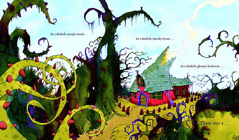
Sara Fanelli was originally born in Florence, Italy. She now lives in London after studying at The Royal College or Art since 1995. Although her illustrations are not my normal taste in illustration I can see the appeal to others, her mix-match cut and paste and unusual perspectives styles illustrate her own perception perfectly. And I can see how it makes for more of an unexpected outcome rather than the traditional media of paint and pen. This style reminds me a little of Eric Carson who illustrated the Hungry Caterpillar
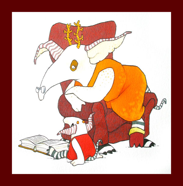
Some famous clients of hers include the New Yorker, Penguin books etc. Her media is mixed however a recurring media she likes to use is the art of printmaking. She uses collage and print within every piece of work. Her target audience initially appeal to children due to her quirky style however I believe that some adult may enjoy the unusual way she presents her illustrations, away from the norm of watercolour and pen. The limit with using collage on illustrations means that they can quickly become out-of-date as the trends of illustrations alter. Her stlye reminds me of the similar mix-match style of the Picasso during his        Cubism era. I think this sort of style would be quite good to try and experiement with as a new design style to try-out.

Ross Collins

Ross Collins is a world renowned Children's author and Illustrator. He writes his own novels then illustrates them using watercolour, pastels and ink, which is then emphasised and edited together digitally.

Page from 'Billy Monster's Daymare
Source: http://www.rosscollins.net/picturebooks/billmosterdaymare/BillyMonster01B.jpg
http://www.rosscollins.net/buyart/no-11.jpg
He was born in Glasgow in 1972 then attended and graduated from the Glasgow School of Art in 1994 with a First in Illustration. In the same year he won the MacMillan Children's Book Prize. Not only does he illustrate his own books he also does many pieces of work for other authors including Guy Bass, Ali Sparkes etc. His work is known for being quirky and unusual which makes him sort-after for illustrations to create an unusual set of characters. 

I really like the look of Ross Collins work, they are unusual and vibrant which allows for his characters to be emphasised. I remember from my own childhood reading some of his books, therefore he is commonly known and loved; his numerous awards are a reflection of this. 

Chris Ware

Chris Ware is an American comic book artist, his work is central around the theme of depression and emotions. His first pieces of work appeared in the Student Newspaper of University of Texas Austin. Here he had daily multiple comic strips all illustrating various points.


Source: https://blogger.googleusercontent.com/img/b/R29vZ2xl/AVvXsEgQCIt5njh7TGgYrwXqTZYd53-nFJGD1mYKksQPHN4ChyphenhyphenMyiYf32PpLUIccbhAo2dZE_7INblMfPGPW71ttzFCqw0VMPjB0GlGVc_XO9vGVMB_QMULC78Gj3_9Ox1HWKCQhqHE18TFdoNB1/s1600/WareSuperman.jpg


One of his most famous characters is "Quimby the Mouse" he was modeled after Felix The Cat and Mickey Mouse. It is said to be a self-reflection on  of his childhood, especially his relationship with his grandmother.

Ware uses simple black outlines over his roughs then takes these to photoshop to add the colours, tones and text to the comic strip. He uses vivid colour and makes his lines realistic. His comics are open to all ages as they have some subliminal messages within his work, hinting at depression and emotions, and social isolation.


Overall I like his work because it is rather realistic however due to the use of block colours he creates a flat appearances within his comic strips. I like to pick out the hidden messages within each comic and see if his messages are obviously portrayed. 

Alan Fletcher

Source: http://upload.wikimedia.org/wikipedia/en/e/ec/AlanFletcherGraphics.png


Source: http://designmuseum.org/media/item/4818/-1/102_10Lg.jpg

Alan Fletcher is an African-born British graphic designer, now living in London.  He is well known for creating some of the biggest logo's we see today.

He integrates the use of type with his whole designs. Very often he uses simple colour schemes and uses the patterns and shapes of the type to be the main focus.

He is probably best know for being the founder of the design firm Fletcher/Forbes/Gill in 1962. After switching between other partners this business then became known as Pentagram in 1972.


Personally I like his work, the simplicity of the designs are much more striking than one that incorporates lots of elements within it. His audience is non-specific and is well suited for a large variety of people, making the logo's more useful and reachable. I believe there are no hidden messages other than wanting to express his love for design within his own design work and self-created novels.

He has also written and published many books himself based on design, the most famous of this list is 'The Art of Looking Sideways' (2001.) He was described by The Daily Telegraph as "the most highly regarded graphic designer of his generation, and probably one of the most prolific".