Evaluation

My Blog Overall:

Usually when researching someone I would briefly scan through some pages on the Internet and feel that it would be sufficient, not really realising the true potential that effective research can offer.
The assignment took me through a journey of researching a name I had never heard of to knowing their entire background history and into the work they produced. Some names on the assignment were more interesting also easier to research, however everyone showed me something new, it displayed a field of people with all similar talents creating something so much different from one and other. I felt that when researching these names I either took an instant like or dislike to their work, I think this is clear in my blog when comparing the difference in depth of research compared to other names.

I did find that some names on the assignment were harder to research for example some names had little or next to non-Internet sources about them, I believe that these names were put in place to sway us to more non internet based sources such as books and magazines, unfortunately whilst looking I could not find many other sources of information for the people I felt I really liked.


1.1
My research that I have used and blogged about has definitely contributed massively to my designs and ideas, the ability to blog your research and then to add comments thoughts and theories is definitely a bonus to anyone trying to develop a design. It enables you to research and then come back to it at a later day and have notes to work from. It enhances the way you take information in and remember it, from personal experience I know that I will attempt to research something, read the web page and as soon as I have left the webpage forget vital parts of the information, blogging enables you   capture that vital information picked out from masses of pages and allows you to come back to it without having to read the entire page again. It’s a bit like printing lots of pages off highlighting the key areas which have relevance to you and holding them in a massive file, but this Is so much more easier and allows you to go straight to the information you want to read as it is categorised and formatted fit for you.
I feel that research is a vital part of design however; I feel that research is only relevant to you, therefore too much, or to little research is all dependants on you as a person. If you feel that the research you have gathered, has successfully provided you with an idea and you have enough research to back that idea up and develop it into a final design, then that is all you need, I feel that in these assignments, there is a lot of pressure to display mass amounts of research, where realistically people are only using a small percentage of that research to effectively create a great design. Overall I think that the research I have gathered has definitely aided me in my design.

1.2
I feel that visual language and the ability to express my ideas on paper definitely has room for improvement, this is an area I am not confident with and really need some guidance to show me the ways I can effectively express my ideas down for others to see. I find myself thinking of an idea and just going about creating it, rather than putting it down on paper, this creating a nock on effect, hindering the ability to develop and manipulate my idea to improve it.

1.3
The biggest learning experience has been the ability to research a person that I have never heard of before and the ability to blog about that person offering not only information about them, but personal comments about the person as well. When first enrolling on the course I could never have imagined that research could play such a vital role in any type of design, but this assignment has proved me wrong.
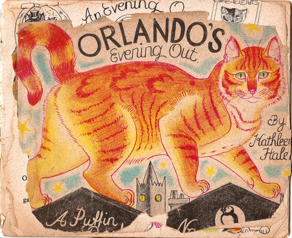
It has been made clear to me that although you may set off to research someone for a particular task, it is always good practise to research more than you should about that person, because you don’t know when you might come across another assignment or experience which will require you to use the knowledge of that person in a different situation, for example, during the Hero’s and Heroine’s assignment there was one person I was drawn to, which was Shirley Hughes and how influential to was many other illustrators at the time as well as present day. 


                                                                        -*-*-

Overall using a blog to create in-depth research is a good idea, it is a versatile way especially due to smart-phones enabling to do it on the go makes it a much quicker way to update your portfolio and refresh your audiences news feed. I will definitely use blogging again in the future however rather than using it for purely research I want to incorporate my work and some influences as that way it will be totally relevant to me, rather than searching artists that I do not find inspiration from. 

Creative Futures Student Conference 2013

http://www.theforumnorwich.co.uk/media/2013/banner_575.jpg
Glyndwr University held a Creative Futures Week where many artists from a variety of areas and careers where invited in to talk to us and give us  an insight into the realities of working in the creative industries. They provided ideas and various opportunities to develop professionally. And told us that if you network within the industry and contact professionals, they can help develop your future career.

Monday 4th March 2012


On the first day the morning conferences started off as a general insight into the design industry and how you conduct yourselves, as well as a quick run-down of what the plan is for the week.

Some quotes for the morning were:
  • “work harder and be smarter than the creative director”
  • “be original, find your own influences”
  • “passion will drive you to work harder”
  • “its not how much your degree costs, its what you do with it”
Sarah Mair Gate (Creative and Cultural Skills).


She gave to us a brief chat about their work and website and how they interacts and helps students and graduates in the Creative Industry to find a job.Basically the speeches during this session were brief heavy and largely statistic focusing on advertising their works.But after Stuart Cunningham make me reflect better when he suggested that if more people stayed to work over Wales Industry obviously the wages shall rise.

Tuesday 5th March

Phil Hirst (Getting a job in the Media)
He spoke about graduation importance and how to climb the industry ladder. When you finish your graduation then different lines start to be clear, doors start to open and to many ways become more understandable, what’s going on and what’s this for, what is that for, all this become just natural, all things around get involved. We really need to study Media Studies for understand small and big things that happens around.


The companies in Media looks for people that shows clearly strong skills evidences through the way that increase effort and passion for the Media.
Journalism got a different view and Methods specifics for them views and that don’t work for me and my personal perspective, point of view and my own way to think.

Through the Organisations and Jobs researches, Enthusiasm and Passion for the area, Broad General Knowledge and Curiosity to Learn more, Practical Work Experience, Determination and Persistence. We must to get some Work Experience, moving around and make some Apprentice Improvement, Volunteer on Student Newspaper, get involved in Studio Radio, work by Charity in Hospitals, Community Centres, Radio.


Wednesday 6th March 

Yasia Williams Leedham (Book publications) 
Yasia graduated with a degree in Design and Art Direction from Manchester Metropolitan University in 1998 and moved to London where she began working fin magazine design.
Overall I found it interesting and very informative; she first told us how she worked her way up from graduate to the position she currently holds. She also emphasised how important work experience was, and that even work experience staff have helped put publications together and gained full time jobs from it. Furthermore she said about the market and the changes and the factors that effect her job such as eBooks. This made me realise you need to be flexible within your work to adapt to society changes.


Thursday 7th March

Kirsteen Harris-Jones ("How to be a children's book illustrator")

Kirsteen was an ex student of Glyndwr University (whilst it was NEWI) and spoke so highly of all the staff. This talk was one of my favourite as it the most relevant for myself. She showed us work, and spoke of her experiences as a freelance illustrator. 
Again she was emphasising the importance of work experience and how it helps to reach jobs in the future. 

http://www.waterstones.com/wat/images/nbd/m/978140/880/9781408800027.jpg
Furthermore she mentioned how she had previously had trouble with an Design Agency she was with straight from University - from this I will definitely take a lot of consideration when chosing my agency. This has also helped me realise I would like to get jobs via an agency; although they take a cut of the money the legwork of finding jobs and advertising will not be done by myself as well as fitting in actual illustration work, with an agency you can have jobs lined up one-after-another.


She also talked us through what happens from the moment you get a commission to completing the final piece, this taught me there are lot of middle steps as well as lots of communication between myself and the client before going ahead. I found it all very useful and inspiring, even when reiterating the fact that you have to take the uninspiring jobs until you could get a good deal.


Shirely Hughes


Shirley Hughes is one of the best-loved and most innovative creators of books for young children. She has written and illustrated over 50 books, sold more than eight million copies, won major awards and created some of the most enduring characters in children's literature, including Lucy and Tom. Author and illustrator Born 16 July 1927, West Kirby, Cheshire, England United Kingdom.

She was educated at West Kirby Grammar School, and studied drawing and costume design at the Liverpool School of Art, then the Ruskin School of Drawing and Fine art in Oxford. She was there encouraged to work in the picture book format and to make lithographic illustrations. Hughes began her work during the 1950s and 1960s by illustrating other authors’ books, such as My Naughty Little Sister by Dorothy Edwards and The Bell Family by Noel Streatfeild. In 1960 she wrote and illustrated her first book, Lucy & Tom’s Day, which was made into a series of stories. She went on to write over fifty more stories, including a series about a young boy named Alfie, and his sister Annie-Rose, as well as the Olly & Me series. An exhibition of her work was put on at the Walker Art Gallery in 2003, which then moved to the Ashmolean Museum in Oxford.

From what I have seen her illustrations are very accurate, more life like rather than cartoon etc, this is probably due to the story's she writes, they are for children to really imagine they are part of the journey and the story involved. I like Shirley’s work as the bold and bright colors are highly ascetically pleasing and her style of work is remaniciant of may childhood books. The use of shading and light really brings the illustrations to life. I do enjoy this style of illistration however it is not my chosen style of work as i prefer a more graphic approach to art. 

Kathleen Hale

Kathleen Hale was born in 1898 in Broughton in Lanarkshire and was brought up in a suburb of Manchester. Her childhood was far from idyllic, her father died when she was very young and she was forced to endure long periods of separation from her mother. This, along with the frustrations of an unexpressed artistic talent, produced a rebellious reaction in the young girl's naturally ebullient nature. 

In 1917, Kathleen moved to London to make a life for herself as an artist. She worked for some time as Augustus John's secretary whilst developing a wide circle of friends in the artistic community, such as Vanessa Bell and Duncan Grant. During the twenties she earned a living as an illustrator, accepting commissions for book jackets as well as selling her own drawings. She created Orlando and his world to entertain her children at bedtime. Kathleen Hale died on 26th January 2000 at 101 years of age.

Orlando The Marmalade Cat 'with eyes like twin gooseberries' was one of the most popular classic children's book characters of the 1940s and 50s. The stories are renowned for their quirky wit, magnificent illustrations and their ability to combine excitement and adventure together with and appreciation of friendship and family life. The books continue to be read by generations of readers who have come to regard Orlando with great affection and delight in the nostalgic memories evoked by the stories. As the creator of Orlando, Kathleen was awarded the OBE in 1976.

http://vintageposterblog.com/wp-content/uploads/2011/09/ppb-orlando.jpg
In the above link is an article written by weekend telegraph about an interview with Hale herself. In the article she tells the telegraph that she hates Orlando, her most famous creation. The interviewer asks if there will be any more Orlando books, but she replies with " there are too many already", also giving "because they are so awful" an answer to why she had not looked at the books in years. 
Not having read the books as a child i am unsure on how to take the storys, i am awaiting a copy of 'Orlando the marmelade cat - a camping holiday, i was intrigued to see what i had missed out on as a child, from looking at the illustrations used in the books, through the illustrations she has managed to build up an image of a mischievous cheeky ginger cat.


Although such a well loved creation, it is clear to see that Hale feels this creation has obviously hindered her progress and ability to move onto new projects. She got caught up in the continuous production of the story of the marmelade cat that she never got the chance do broaden her mind.

Eboy

eboy.co.uk
They express their art as an extension of their childhood. Their influences come from: “Pop culture… shopping, supermarkets, TV, toy commercials, LEGO, computer games, the news, magazines…”Kai was the only one who grew up with Nintendo to inspire him, the rest of the eBoys lived in East Germany where video games didn’t exist.Their work makes intense use of popular culture and commercial icons, and their style is presented in three-dimensional isometric illustrations filled with robots, cars, guns and girls. Mostly their designs are printed today and not used solely for computer screens anymore, allowing images to get more complex with details.“If we don’t work on other projects at the same time it takes about six to eight weeks to finish a very detailed cityscape, three eBoy’s working on it, nearly full time. But, if we have to do it in our spare time, which happens often, it could take years to finish a picture since we can’t spend so much time on it.” Their unique style has gained them a cult following among graphic designers worldwide, as well as a long list of commercial clients. Their latest project are plastic Peecol toys with Kidrobot, and soon a new line of wooden toys are to be produced under their own label.

http://blog.donax.ch/public/images/Posts/vevey-eboy.png
Their work is fun, futuristic and crazy, the only words that can describe Eboy. Eboy creates artworks created from complex illustrations ranging from robots, buildings, cars all the way through to people. Eboy also has a wide range of products available to purchase such as t-shirts, posters, and souvenirs. Eboy also has artwork displayed in gallery exhibitions. A very different approach to design making use of various different illustrations to build up a imaginative society. The pixelated work style reminds me of a "Where's Wally" type illustration, I really like their work! 


Peter Saville


Peter Saville is a designer whose twenty-five year practice spans the fields of graphics, creative direction and art. Born in Manchester, England in 1955, he studied graphic design at Manchester Polytechnic from 1975-1978.

In 1979, he became a founding partner of the landmark, independent record label Factory Records where he created some of the most recognisable album covers of all time for Joy Division and New Order. Saville’s many clients have included Roxy Music, Ultravox, Peter Gabriel, Pulp, Suede, Whitechapel Art Gallery, The Pompidou Centre, Yohji Yamamoto, Jil Sander, Christian Dior, Alexander McQueen, Stella McCartney, Mandarina Duck, Givenchy, Selfridges, EMI and Adidas.

Saville’s reputation for contributing to the progressive design profile of the city of Manchester since the early 1980s has earned him an ongoing consultancy to programme Manchester’s artistic future from its city council and an honorary doctorate from his alma mater, now at Manchester Metropolitan University.

Saville creates artworks for both the Paul Stolper Gallery and Hotel in London and Gallery Neu in Berlin. His work is noted for combining an unerring elegance with a remarkable ability to identify images that epitomise the moment.

He is a talented designer. I like use of colours that he applies in his works by transmitting light onto them. I consider him a genius of art to draw attention through what he produces. He is widely seen as an important and influential figure, amongst the design industry.

John Maeda

John Maeda is a Japanese-American graphic designer, computer scientist, university professor, and author. His work in design and technology explores the area where the two fields merge. He is the current President of the Rhode Island School of Design. He is a world - renowned graphic designer, visual artist, and computer scientist MIT Media lab, and is a founding voice for "simplicity" in the digital age.He jokes about himself as “the guy who makes the flying letters.” But behind this joke is a deep insight into the way good programming can create new forms of good design — the guiding principle of Web 2.0, where type and images can behave in brand-new ways to communicate and amuse.

I enjoyed his laws of simplicity" book after studying it myself for a previous typography brief. He describes his theory by using what he calls 'cookie vs laundry method' in this methods he explains that, if you gave a child the choice between a big cookie or a small cookie, they will pick the big cookie, but then said if you gave the same child the choice between a large laundry basket full of clothes and then a small laundry basket, the child will pick the smaller basket, this theory is based on the rule that we all want more for less, enjoy more and work less.

Although I am not a graphic designer myself, I think Maeda's work is brilliant, and his laws of simplicity is something I can take across within my illustrations, as sometimes less is more. This is a good way to think as usually the more simple something is, the bolder and more impact it creates. 

http://www.33rdsquare.com/2012/10/john-maeda-talks-design-and-leadership.html

Pentagram - Design Company

Pentagram is one of the world's largest independent Design Consultancy. The company is one of the biggest multi-disciplinary design consultancy firms, that is shared and ran by 16 partners, friends who are all individual artists within their creative fields.

They have bases in London, New York, Berlin and Austin. Each client works directly with one or more of the partners. This reflects their conviction that great design cannot happen without passion, intelligence, and personal commitment, which is demonstrated by a portfolio of work that covers five decades.

After looking at their website and other examples of their work I feel that a lot of the work for clients are a similar style, even though they are for different companies. I think this is a good trait as although they are a graphic designers and can mould to fit any clients specifications, the fact that their own styles still show through the design make the company more easily recognisable a good trait for any artist/designer to have. All of their design pieces are flat and perfectly crisp outlines, and look extremely professional in my opinion.

source: http://www.pentagram.com/work/#/posters/all/newest/

Tomato - Design Collective

Tomato is a "Art & Design Collective" founded in 1991 by John War Wicker, Steve Baker, Dirk Van Dooren, Karl Hyde, Richard Smith, Simon Taylor & Graham Wood. They were originally based in London. They are a collection of designers, craftspeople, musicians and writers, this making them the widely creative diverse group that have helped them within their success.
tomato.co.uk/newyear
Tomato provides the following services: Architectural Design, Consultancy, Drawing, Education, Electronic Interactive Media,Film & Commercial Direction, Graphic Design, Fashion, Motion Graphics, Music & Sound, Strategy, Branding & Identity, Photography, Publishing, Title sequences & Typography.
Tomato have exhibited internationally and lecture and hold workshops widely. Their designs that incorportae multiple platforms are commited to developing entirely new media solutions for clients including packaging design for Casio, to shoe design for Adidas, to a TV commercial for Chanel. 
Their work is brilliant and emphasises all of their conceptions beautifully and individually in order to capture the attention of the public and achieve the clients intent.

J Otto Seibold

http://tuttalacartadelmondo.blogspot.co.uk/2009_01_01_archive.html
J. Otto Seibold is an illustrator of children’s books, as well as some picture books intended for all ages such as Going to the Getty, including pieces such as 'Monkey Business', 'Penguin Dreams' and 'Alice  n (pop-up) Wonderland' He has showed at Grass Hut, The Yerba Buena, and Le Estrange in Paris.

From the work I looked at, his illustrations appeared similar to other children's book illustrator's, until I found some work which encoporated 3D pop-up books (pictured right), something I had have not seen from many illustrators; it is a really unique way of displaying illustrations, and makes it more exiting and full of fun for children when reading books. His use of vibrant colours in bold block colours are the elements that make them appealing to children, and you can clearly see why his illustrated characters are loved by children. Definitely an illustrator I can take inspiration from.
https://blogger.googleusercontent.com/img/b/R29vZ2xl/AVvXsEhI4ae6TTFlJ_AjlUL3mS-HimZHBmWdF4uR9NA2DUKThaO6FRNz1yG3_bcYz_9i5fPB51eX5bqasmvaSrHEbWjJxWpTg5Q75E7GlSgH1jDn7t3AwOYMMbgXRDrQ7o2w_FtRxAuREcpInCI/s1600/othergooseinteriorart.jpg

Lauren Child

http://images.wikia.com/laurenchild/Charlie_and_lola.jpg

Lauren Child was born 1965, London and is an English author and illustrator. She is typically most famous for Charlie & Lola illustrations, and is loved by many children for her creations after them being turned into a Television series for many to watch. Her success I think is fantastic, especially considering she didnt start her career until her mid thirties after what she describes as fitful, frustrating university career (a “disastrous” year studying art at Manchester; a disappointing mixed media course at City and Guilds) she spent her 20s “floundering dreadfully”, living hand-to-mouth in London. She introduced Charlie and Lola in 2000 with 'I will not ever Never eat a tomato' and won the annual Kate Greenaway Medal from theLibrary Association for the year's most "distinguished illustration in a book for children"

She has a unique style as she produces her illustrations. She plays with bright colours and inspirations taken from where she lives. Her style reminds me of Quentin Blake's style. She uses bold colours for the background, in order to bring out the characters, along with bold black outlines. This along with they typica-child-like poses she places her characters in, they emphasise the movements and thoughts of children perfectly. She is one of my all-time favourite illustrators that is widely known for her beautiful creations.
http://heidigracekress.com/cms/wp-content/uploads/2012/03/Lauren-Child-with-trees.jpg

Scott McCloud


He was originally born Scott McLeod on June 10, 1960. He is an American cartoonist and theorist on comics. He is most notable for his non-fiction books about comics. He has been creating comic books since 1984. 
One of his most famous books is 'Understanding Comics', a book of his that I own myself, is a comics book written about comics as an artistic medium, and how to create them. McCloud believes that comics have been in existence for centuries, although many great works of art are erroneously categorized as other art forms instead of comics. He explains the fundamentals of the genre, including the passage of time, depiction of motion, and broad interpretation by the reader as elements unique to comics.

He uses just black ink on white paper to create very simple and precise illustrations, makes use of line drawings. These are then taken onto photoshop to add the blocks of colour to, they are easy to read and understand. After owning one of his books, I have been admiring his work for many years. Although it is a style I cannot create myself, comic book art itself is a very skilled type of illustration, making them all flow continually and fit perfectly to convey the story to the target audiences. 

Photo source:
https://encrypted-tbn2.gstatic.com/imagesq=tbn:ANd9GcTrZo0P8dE8YWFqQKeBLgrJAgTWHFvOfs7X6J8Ld_pzGc4qQsVH

Joel Stewart

http://www.joelstewart.co.uk/blog2/peeksamples/03.jpg
Joel Stewart from London, United Kingdom Illustrator, author and director of The Adventures of Abney & Teal, currently on CBeebies.

He began his career with the picture book The Adventures of a Nose, which he conceived with author/illustrator Viviane Schwarz. Joel says, "It's really great that I got started with such a bizarre concept, as it's allowed me to be quite free with my ideas subsequently. Bizarreness is not the point, however. I see the core of what I do as emotional narrative. It just takes some strange ideas to put this across sometimes."

http://www.joelstewart.co.uk/blog2/peeksamples/03.jpg

Joel has written his own self-authored picture book and hopes to do more writing in the future. He would especially like to create comics for children.
When he was younger Joel Stewart wanted to be a sloth, this showing at young age he had an strong  imagination. His love for animals, along with his vivid imagination, has influenced his illustrations, which is the source for these unreal creatures that he creates. He creates different animals, that make up one mythical creature, his illustrations include widely exaggerated features. He adds personality and character to each of his illustrations, making them seem more alive.


Kyle Cooper

Kyle Cooper has directed over 150 film title sequences, and has been credited with "almost single-handedly revitalizing the main-title sequence as an art form". He is the founder of two internationally recognized film design companies, Imaginary Forces and Prologue Films. Cooper earned a M.F.A. in Graphic Design from the Yale School of Art, where he studied independently with Paul Rand. Cooper is a member of the Alliance Graphique Internationale and holds the honorary title of Royal Designer for Industry from the Royal Society of Arts in London. Claims his greatest influence in his choice of profession (i.e. title designer) is Stephen Frankfurt's opening title sequence for To Kill a Mockingbird (1962).
Directors don't call on Cooper for a signature style; they hire him to dig under the celluloid and tap into the symbolism of a film. That aptitude first became apparent in 1995, with the abrasive and highly stylized intro to David Fincher's Se7en. 
As a filmmaker, Cooper is all about precision. When you're doing a two-minute movie, being obsessive about every cut, every transition, and every manipulation of every letter is a job requirement.The production on Spider-Man 2's titles, from conception to delivery, has stretched almost an entire year. Cooper began by digitally scanning dozens of vintage Spider-Man comics and editing them together in a blink-and-you-miss-it five-second montage that encompasses the entire story arc of the first film. I think his work is brilliant as a filmaker, you can see as the audience that he has studied the film that he is trying to advertise, the subliminal messages that are hidden within the original film are sought-out and played on through the trailers he creates. 

https://blogger.googleusercontent.com/img/b/R29vZ2xl/AVvXsEgbzo97Hr0Me1LMQq-vazMI4_aOvLF5cXZ1gGAZyqvjVqXHQ3IFqrzKD55OfHWsXCFfcF0a1Pm4Di7zg5cHDpljgQjtjKWcFyKDdggnCjr8NxkuxPrjycnmKR4SlSPlkHKhAAEd1OpwRKE/s1600/Descredit-se7en844.jpg

Michael Gondry

Michael Gondry born May 8, 1963) is an Academy Award-winning filmmaker, whose works include being a commercial director, music video director, and a screenwriter. He grew up in Versailles with a family who was very influenced by pop music. When he was young, Gondry wanted to be a painter or an inventor. In the 80s he entered in an art school in Paris where he could develop his graphic skills and where he also met friends with whom he created a pop-rock band called Oui-Oui.  
One of his videos was shown on MTV and when Björk saw it, she asked him to make her first solo video for 'Human Behaviour'. The partnership is famous: Gondry directed five other Björk's videos, benefiting by the huge budgets. This led to commissions for other artists around the world, including Massive Attack. He also made a lot of commercials for Gap, Smirnoff, Air France, Nike, Coca Cola, Adidas, Polaroid and Levi - the latter making him the most highly-awarded director for a one-off commercial.
I think he manages to convey himself through his film basically he can do what many do not. His work is unusual however you can tell that he is passionate about being arty and his work express his love and experience of the industry, growing up around many strong current influences. 

http://collider.com/wp-content/uploads/michel_gondry_image__1_1.jpg

David Hughes

http://www.centralillustration.com/CMS-data/artist-images
He was born in Twickenham in 1952. He describes himself as "a graphic designer who happens to illustrate." Expressing the desire to become an artist from a young age, he studied at Twickenham Technical College in the early 1970s, completing a four-year course on (largely technical) Illustration. Towards the very end of his course, he discovering an interest in etching and produced "a small series of etchings based on a piece of jazz by Charlie Parker."
After leaving college, he produced his first commissions for The Daily Express's cookery page, but became frustrated and disillusioned by the lack of creativity involved. A lack of "sympathetic advice" saw him abandon drawing for "a year or so," to become a postman. During this time (mid-1970s), he was re-inspired by a Post Office colleague to take up life drawing again, and eventually became aware (through the work of "amongst others, Ian Pollock, Russell Mills and Chloe Cheese") that there was a market for his talents.
His illustrations were not what I expected when I initially looked at them. I have to admit, his work is not my normal taste in illustrations, they try to imitate some humour and character however I find most are bland and dull. The markings are scratchy and they seems as if it takes just a few minutes to produce them.

Jonny Hannah

Jonny Hannah was born and bred in Dunfermline, Fife. He studied illustration at Liverpool Art School and the Royal College of Art. Since graduating in 1996 he has worked as a freelance illustrator. His many clients include The Daily Telegraph, The New York Times and The St Kilda Courier. Any spare minute is spent at The Cakes & Ale Press, Jonny's cottage industry, producing fine printed ephemera, from his garden shed in Southampton. In 2000 Jonny won a BAFTA for his film The Man With The Beautiful Eyes.
He uses print (screen, linocut, monoprint etc) to create work that looks like it is made of collage to create his illustrations/graphic pieces. In his work, it is obvious that there has been a lot of thought into text within the illustration in order to convey the messages of the piece, however it is not to my own personal taste. 

Ian Pollock


Ian Pollock is from Cheadle, Cheshire in 1950, the son of Gordon Pollock, a traditional claypipe manufacturer. He was educated at Woods Lane Secondary Modern School, and Moseley Hall Grammar School, Cheadle, Cheshire. He then did a foundation course at Manchester College of Art and Design, and in 1970 went to Manchester Polytechnic. On graduation as BA with First Class Honours in 1973 he went to the Royal College of Art, and on getting his MA in 1976 became a freelance illustrator.
He has published and illustrated a number of books – starting with Beware of the Cat in 1977, and has designed posters for the Royal Shakespeare Company. He works mostly for magazines and newspapers, appearing regularly in the “quality press.” His work has appeared in Rolling Stone, Playboy, Penthouse, New Yorker, Talk, Esquire, GQ, New York Times, Wall Street Journal, Elle, Country Life, Radio Times, New Scientist, Creative Review, Design Week, Stern, Sunday Times, Independent, Guardian, Observer, the Financial Times, and Daily Telegraph amongst others. As Pollock puts it, he will “work for anyone – even the taxman.”
He communicates humour through his illustration work. I love the use of media that he uses, ranging from soft watercolour blocks to bold inky lines, this detailing of certain parts of his illustrations help emphasise main points - for example, the face of a portrait or the humorous elements he adds to most of his work. This is the trait of most caricature artists and one that Ian Pollock demonstrates perfectly.

The Chase

The Chase is a graphic design and branding company with multiple annual awards ranging from Creative Review Awards - 1000 Words and Almost Extinct, to Design Week Awards. They have offices in a few local areas, they are based in Manchester, and have smaller ones in Preston and London

One of my favourite pieces of work that The Chase has produced is the Manchester Dogs Home Annual Review. I live quite locally to Manchester, which initially caught my attention however then I realised it was in aid of rescue dogs - something which I am passionate about as I have a few rescue dogs myself. The review is almost like an advert for the dogs, they use subliminal messages within the pieces which provoke sympathy and empathy for the dogs in the photographs. 

For such a large company to still do small business commissions is brilliant, it keeps them true to their roots and gives them the credibility and recognition. 


Vaughan Oliver


Vaughan Oliver is a British graphic designer from Surrey, now based in South London, he is known for his work with design studios "V23" and "23 Envelope" Here he creates lots of famous album covers that are "sometimes gritty, sometimes dreamy" He uses colours, composition and typography to express moods to match the music inside.  

This example of his work 'Fluid Songs' is one of my favourites, it is simple and yet still captivating. Photography is a hobby I have done for many years however I have recently taken to other media's. To see examples of amazing sepia photography is a possible direction I could include within my work. The typography on this photo is brilliant, the main focus is the simple black text which is encased in the maroon subtext, the swirls and curls of this illustrates the plant behind and natures curves - this I believe is Oliver's intention.

Why Not Associates

Why Not Associates is a British graphic design company. They have big clients such as Nike, Virgin Records and the BBC, and are continually producing brand new ideas and concepts for clients.


"Effective communication contains an element of surprise and often the best way to solve a problem is to turn it on its head. we're not afraid to run through a dark room with an arm full of lighted fireworks. fingers grow back, and great work lasts forever." whynotassociates.com


Their work overall is interesting and definitely takes a different perspective on simple items, this uniqueness is something that has given them all the well-earned reputation. Something, as a young illustrator  to take inspiration from - that no matter how bizarre an idea seems, if its something you want to do, you should do it.  

Neville Brody


Neville Brody was born in London, Brody studied at the Hornsey School of Art and at the London College of Printing. The British designer and director is linked with areas within Constructivism and Dadasim he tries to explore ideas that were outside the box, in similar way to Dada movement; one of which I'm a fan of myself. He found that breaking the classic rules of art is similar to the way the music movement was going at this time. Brody was helping to create a new way within design. His work pushed boundaries in type and experimenting with image, especially working as a designer for magazines, newspapers and album covers. A recent example of Brody’s guest appearance work can be seen on the front cover of Wallpaper magazine. 


He uses mixed media and several influences of that time to create his work, this is a good way to create work that is in-time and up to date with all the other artists of that time. However due to his unusual aspect of life and the simplicity idea his work, although similar to other artists at his time, are unique with his choice of context. 

Spike Jonze


Adam Spiegel is more commonly known as Spike Jonze, the famous American film-maker, and directer of films, television, commercials and music videos. Furthermore he is part owner of a skateboard company, and directors label. He gained his nickname from competing in skateboarding competitions. 

Most recently Jonze was the director of 2009 'Where the Wild Things Are' but has previously liaised with Weezer, Daft Punk, Beastie Boys, and Notorious BIG, to name a few. Within all his work he injects his style of sly and ironic humour. Most recently he has worked on the "Jackass Movie." However he is still most famous for the 1999 film "Being John Malkovich" and the 2002 film "Adaptation", both written by Charlie Kaufman.

As an artist I think he is successful, although he has an unusual style of injected humour; he is able to adjust and adapt to the criteria, this makes all the films fantastic and successful. As a freelance artist this is a good quality to have as your able to reach a wider audience.

John Lawrence

John Lawrence is a classic English illustrator and wood engraver, widely regarded as the best in his time. Recently retired from lecturing at The Cambridge School of Art, MA Degree course in Illustration, John continues to work full time for Random House, Walker Books and The Folio Society. His distinctive wood engravings and drawings have been his style for over 40 years. The process of his print/collage technique involves different colours and textured backgrounds, these are separate prints that are overlapped into the overall design. He uses a mixture of wood and vinyl to create contrasting textures and which he then manipulates together using a computer. I love this mix of very old fashioned style to new day technology of computer technology.
Over the course of a career that began in the 1960s he has illustrated 100's of books from including ones such as Shakespeare, and one of my favourite, Watership Down, he creates rabbits using watercolours which, have a realistic element to them and yet still given human characteristics.
I myself have previously tried many types of print as was a massive lover of the techniques, especially Lino-cut as they create one-offs that have the unpredicibitly that give them character. From this research it has made me want to create more printing pieces and rekindle the love of printing I once had. I love the fusion of technology as it makes it available on multiple levels, whether it be traditional or newly digital. 

Hi-Res!


Hi-ReS! was founded in 1999 by Alexandra Jugovic and Florian Schmitt after they moved to London from Germany. Their work falls into multiple categories of graphic design, fine art, product design, film and music, which was then decided to combine all these separate disciplines in one and experiment with Adobe’s Flash technology. Their first online commission project, soulbath.com, gained more popularity which created more work and the start of the website for the film Requiem for a Dream by director Darren Aronofsky. 

They are multiple award winning designers, including awards such as D&AD Silver Award and BAFTAs. These awards have helped them get high-profiled clients, including Docle & Gabana, Chanel Hyundai, etc. They always mage to make fantastic adverts and websites. 
They are big influence within my own work because they use simple layouts and styles and yet they seem to work out much better.

Daniel Brown


Danny Brown is a artist and designer, from Liverpool; who specialises in Creative Digital Technology and Interactive Design as well as Applied Arts. After leaving school he joined Amaze, the design company attached to the Liverpool Metropolitan University. Danny Brown has developed his own specialist area using generative animation – using patterns that continually grow, develop and mutate within a set of programmed rules. His subjects that he uses in his work, Flowers and Butterflies for example, is inspired by the growth of shapes and patterns in nature. 

I have never seen some of his work before however after finding him on the Internet due to this blog, it has made me a massive fan of his work. I love the floral pieces of work where he manipulates digital images to create his petals. I have also liked this sort of effect after myself experimenting with a similar technique of layering images. I will definitely be looking into his work further and using it as inspiration within my own style.

Susan Kare

Susan Kare, who lives in San Francisco, designed most of the distinctive icons, typefaces and other graphic elements that gave the original Macintosh Computer, its characteristic appearance. Her goal is to make them easy to remember. 

I would say an icon is successful if you could tell someone what it is once and they don't forget it’

She graduated from New York University with a Ph.D. in Fine Art. Kare’s first assignment for Apple Mac was developing fonts for the Mac OS. This was just the start and has then gone on to designing icons for Windows operating systems, bitmapping the virtual deck in the Windows version of Solitaire, crafting logos for startups, products for New York’s Museum of Modern Art, and making prints of memorable icons like the Bomb, the Watch, the Paint Can etc.

From this research it has given me the ideas to possibly draw designs using squared paper, just as Susan Kare does, this would help me create designs using the 'pixel' ideas, either way it would definitely help me to get ideas and roughs that are in line and proportion. It would also make my initial drawings much quicker by simply blocking-in sections; this is something I have been struggling with recently as I take too long in the designing section.

I love her work, and especially appreciate it more now after seeing and using some of her original ideas, in my everyday life. I think she is very successful and highly thought of. 

Yugo Nakamura

                     
Yugo Nakamura is currently "the face of interface" throughout the design industry, more specifically within web design. He studied engineering, architecture and landscape design; after graduating he worked as an engineer specialising in bridge design. He bases all his work around his constant research in the interface environment. 
He is said to be "looking for a good balance between digital and creative work"

He's held exhibitions and lectures of his own from Asia to America and London. He is very clever and keeps the same few element in every piece of work - maths. He actually incorporates mathematics into the designs themselves. 

In my opinion, I really like this work, the use of numbers, although his work is mostly monochrome they are all striking, they look modern , and are incredibly clever; most importantly they are still effective today even on a very large variety of audience - that comes naturally with web design. 

As an artist he regular shares where his inspiration comes from, including traditional sources sources such as traditional Japanese art - he attempts to imitate the detailing and refinement of traditional Japanese craftsmanship on the web. Another inspiration of his is fellow designer - John Maeda, who is said to be the person that drove Yugo to start the path of graphic design. 

I really like his work, the inspiration that he gets from everything comes across within his designs, and as a fellow lover of traditional Japanese art I can see how the traditions are hinted at within his modern web design work.

Jonathan Barnbrook

Barnbrook is a well-known British filmmaker/director, typographer and graphic designer from Luton. He is probably most recognised after his commission on the David Bowie album Heathen, for which was also the launch of his own typeface Priori; this was soon followed by many typefaces which he went on to design. Most of his fonts are named after controversial subjects or emotions as this is a theme in which he continues throughout all of his work. 
He now owns his own company designing fonts called Virus, based in his hometown of London. Here he has teamed up with other typographers to create books based on his field of expertise. 
Although not my usual taste due to me being more of an illustrator but I can appreciate the work of a graphic designer and typographer; the skill it takes from designing the basic ideas of a font to the positioning and layout of the text within a page. Jonathan Barnbrook is a designer that I recognise from previously seeing his designs around before starting my research, this is my eyes makes him successful as his work is already reaching a wide range of audiences. 

Ronald Searle


Ronald Searle was probably most famous for his creation of the famous St Trinian's, it was popular first in print, then as a series of films for which Searle created title sequences, and has still been reused to this day. However his artist career began when he created hundreds of drawings while a POW during WWII, some of the drawings he produced was an inmate illustrations of Changi Gaol, the Japanese Prisoner of War camp. 

Ronald Searle drew hundreds of magazine and book covers throughout his illustration career. He incorporates the traditional English comic ideas which include pointed elbows and shoes throughout all illustrations, and include all the satire that we love as the audience.  

To match his humour he used traditional media of watercolour and ink, teamed along with minimalistic lines and details - retaining more detail to selective areas that draw your attention in. The way he uses this reminds me of Roal Dahl's work with the "inky" effect.
"Searle's work out is genuine wit, intelligence and unabashed ambition. He is one of our greatest cartoonist, with a lifelong dedication to his craft unequalled by any of his contemporaries."
I really love his work, the drawings are loose and simple but I think they capture so much character especially in the ink-based sketches. I can definitely take inspiration from his way of working, looser sketches that have caricature based elements emphasising the main points of illustrations. I definitely want to try more work in ink and little colour.